Welcome to my website U-GINE MEDIA. In this website I teach tutorials and share source code on some programming (HTML, CSS & JavaScript) tutorials.
Before we get started, do well to subscribe to my channel to never miss out on any update that I post every single day.
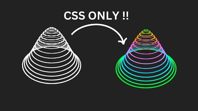
In this tutorial topic "Complete CSS 3D Cone Animation | CSS Loader Using HTML and CSS", we will learn how to create it following these simple easy steps.
Share this to your programmer friends. If y'all learnt something today, make sure to let me in the comments.
If interested in watching the video before running the code below, you can click the play button to get started.
Code Begins
- First, create a folder with any name you like. Then, make the necessary files inside it.
- Create a file called index.html to serve as the main file.
- Create a file called style.css for the CSS code.
To start, add the following HTML codes to your index.html file. These codes include essential HTML markup with different semantic tags, such as div, form, input, button, image, etc., to build the website layout.
<!DOCTYPE html>
<html lang="en">
<head>
    <link rel="stylesheet" href="index.css">
    <meta charset="UTF-8">
    <meta name="viewport" content="width=device-width, initial-scale=1.0">
    <title>CSS 3D Cone</title>
</head>
<body>


<div class="loader">
    <span></span>
    <span></span>
    <span></span>
    <span></span>
    <span></span>
    <span></span>
    <span></span>
    <span></span>
    <span></span>
    <span></span>
    <span></span>
    <span></span>
    <span></span>
    <span></span>
    <span></span>
</div>


</body>
</html>
* {
    margin: 0;
    padding: 0;
    box-sizing: border-box;
}

body {
    min-height: 100vh;
    background: #042104;
    display: flex;
    justify-content: center;
    align-items: center;
}

.loader {
    position: relative;
    width: 300px;
    height: 300px;
    transform-style: preserve-3d;
    transform: perspective(500px) rotateX(60deg);
}

.loader span {
    position: absolute;
    display: block;
    border: 5px solid #fff;
    /* box-shadow: 0 5px 0 #ccc,
                inset 0 5px 0 #ccc; */
    box-sizing: border-box;
    border-radius: 50%;
    animation: animate 3s ease-in-out infinite;
}

@keyframes animate {
    0%,100% {
        transform: translateZ(-100px);
        border-color: #0f0;
    }50% {
        transform: translateZ(100px);
        filter: hue-rotate(360deg);
    }
}

.loader span:nth-child(1) {
    top: 0;
    left: 0;
    right: 0;
    bottom: 0;
    animation-delay: 1.5s;
}

.loader span:nth-child(2) {
    top: 10px;
    left: 10px;
    right: 10px;
    bottom: 10px;
    animation-delay: 1.4s;
}

.loader span:nth-child(3) {
    top: 20px;
    left: 20px;
    right: 20px;
    bottom: 20px;
    animation-delay: 1.3s;
}

.loader span:nth-child(4) {
    top: 30px;
    left: 30px;
    right: 30px;
    bottom: 30px;
    animation-delay: 1.2s;
}

.loader span:nth-child(5) {
    top: 40px;
    left: 40px;
    right: 40px;
    bottom: 40px;
    animation-delay: 1.1s;
}

.loader span:nth-child(6) {
    top: 50px;
    left: 50px;
    right: 50px;
    bottom: 50px;
    animation-delay: 1s;
}

.loader span:nth-child(7) {
    top: 60px;
    left: 60px;
    right: 60px;
    bottom: 60px;
    animation-delay: 0.9s;
}

.loader span:nth-child(8) {
    top: 70px;
    left: 70px;
    right: 70px;
    bottom: 70px;
    animation-delay: 0.8s;
}

.loader span:nth-child(9) {
    top: 80px;
    left: 80px;
    right: 80px;
    bottom: 80px;
    animation-delay: 0.7s;
}

.loader span:nth-child(10) {
    top: 90px;
    left: 90px;
    right: 90px;
    bottom: 90px;
    animation-delay: 0.6s;
}

.loader span:nth-child(11) {
    top: 100px;
    left: 100px;
    right: 100px;
    bottom: 100px;
    animation-delay: 0.5s;
}

.loader span:nth-child(12) {
    top: 110px;
    left: 110px;
    right: 110px;
    bottom: 110px;
    animation-delay: 0.4s;
}

.loader span:nth-child(13) {
    top: 120px;
    left: 120px;
    right: 120px;
    bottom: 120px;
    animation-delay: 0.3s;
}

.loader span:nth-child(14) {
    top: 130px;
    left: 130px;
    right: 130px;
    bottom: 130px;
    animation-delay: 0.2s;
}

.loader span:nth-child(15) {
    top: 140px;
    left: 140px;
    right: 140px;
    bottom: 140px;
    animation-delay: 0.1s;
}

0 Comments
We are happy to hear from you.